Move Mate.
Progress, not Perfection.
Can’t find a time to workout? Look no further because Move Mate is designed to make fitness fit into your life. Inspired by busy individuals seeking a fun and efficient way to get into shape, Move Mate offers customizable routines, flexible scheduling, and motivating challenges. With Move Mate, you can transform the way you approach fitness by making it inviting, enjoyable, and easy!
Project: Responsive Web Application, UI Focus
Role: UX/UI Designer
Duration: 2 months
Tools: Balsamiq, Figma, Sketch, Lucidchart, Pen & Paper
The Problem?
Finding and maintaining an exercise routine can be challenging, especially for beginners or those returning to fitness. Busy professionals, like Rebecca, who make up 80% of people with a sedentary job (NIH Study, 2020) struggle to incorporate effective and enjoyable workouts into their daily lives. Moreover, traditional fitness apps often lack simplicity and flexibility, leading to inconsistent exercise habits and a decline in motivation.
The Solution!
Discovering this gap in the fitness industry, I created Move Mate. A dynamic web app that makes fitness fun, personalized, and easy to access. By seamlessly integrating fitness into user’s busy schedule by providing flexible workout videos, progress tracking, motivating challenges and redeemable rewards, people like Rebecca can enjoy their workouts, build sustainable healthy habits, and finally reach their fitness goals. One day at a time.
User Needs.
Easy-to-find exercise routines that match fitness goals (weight loss, getting into shape etc.)
Short exercises that can be done multiple times a day
Clear exercise guides with examples
Motivating tools like achievements, rewards, and daily challenges
Progress tracking through visuals and various metrics
Ability to share routine with friends and co-workers
Exercise recommendations with various fitness levels
Business Goals.
Increase user engagement and retention by providing a user-friendly and motivation platform
Encourage repeat usage though elements such as achievements and rewards
Establish app as a reliable and enjoyable fitness solution for busy individuals
Build community aspect by allowing for social sharing and interaction among users
Attract wide audience by offering customizable exercise options
Our Ideal User
Move Mate’s Core Functions - User Flows
As someone who’s had a rocky relationship with working out myself, I completely understand Rebecca’s needs, frustrations, and goals for an app that isn’t intimidating, and actually guides you during workouts. Not to mention, an app that promotes a sustainable healthy lifestyle, because long gone are the crash diets and fad fitness routines.
I also understand the importance of meeting business goals as they ensure the business is moving the right direction to provide better resources for designers like me to keep making user-centered products for people like Rebecca.
With that said, here are the 4 core features of Move Mate that aim to resolve Rebecca’s needs, goals, and frustrations!

Building a workout routine could not be more easy! Rebecca can either go to the schedule builder page or add videos or playlists directly to her schedule from the workout page!

When Rebecca needs a confidence boost, all she needs to do is view her amazing progress! Whether it's her water intake or completed exercises, this page reminds us all that it's all about progress, not perfection.

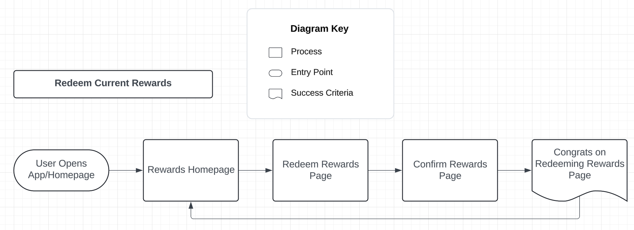
Who doesn't love free money, especially if it helps you build a healthier lifestyle? Rebecca can redeem her points from completing daily challenges to redeem gift cards from Amazon, Target, Publix, and more!

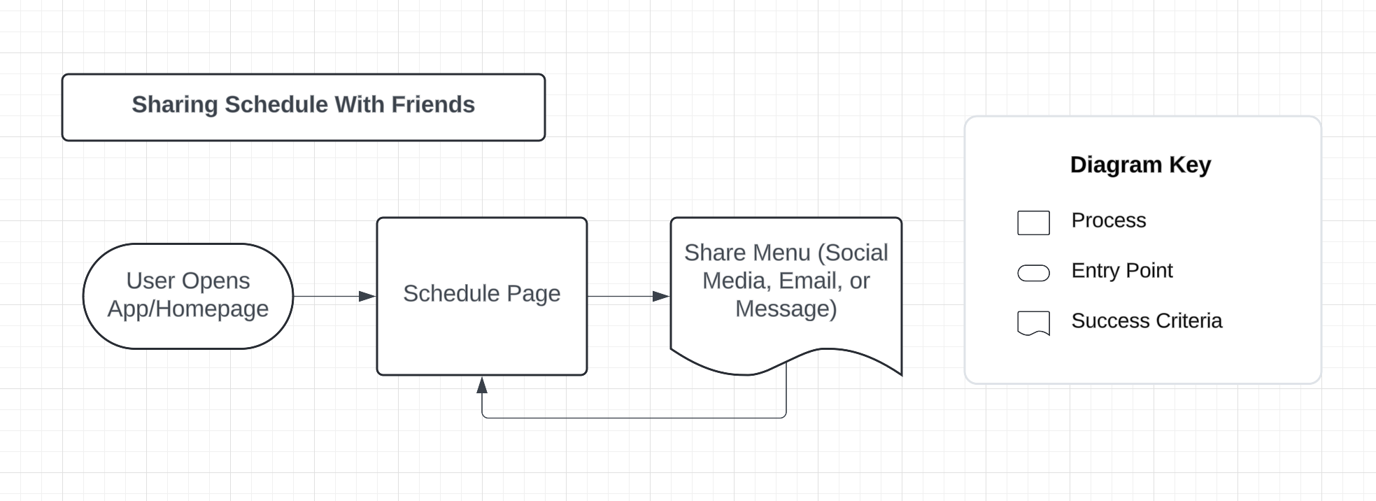
Teamwork makes the dream work! Rebecca can share her schedule with friends and co-workers as easy as 1, 2, 3!
Laying the Ground Work.
After creating the user persona and user flows, I built some low-fidelity wireframes on Balsamiq. After taking inspirations from apps like YouTube and Peloton, I decided on the 5 main features that reflects my user flows and would cover all of Rebecca’s needs:
Dashboard - so users can have a high level and easily accessible overview of each section
Schedule Builder - where users can easily edit their workout schedule, sync it to their main calendar, and share with their friends
Workout Page - the main place for users to add new workouts to their schedule and build playlists for a more personalized routine
Progress Tracker - from steps to calories, users can track a variety of metrics because nothing is more motivating than seeing how far you’ve come
Rewards Section - a healthy lifestyle can be expensive which is why Move Mate turns users progress into points that can be redeemed for a variety of gift cards from Amazon, Target, Publix and more!
Two Ideas. One Direction.
Now that I had the bare bones of Move Mate, it’s time to add some color! After some brainstorming, I came up with two completely different directions.
Mood #1 - Calm, Clear, Inviting
Mood #2 - Fun, Motivating, Helpful
After much contemplation, I decided to go with Mood Board #1 because it makes more sense for someone like Rebecca. As someone new to consistent workouts, Mood Board #2, though lively and encouraging, might be overwhelming for her.
Given her busy schedule and beginner experience, a clean and calm app will be more beneficial. Mood Board #1 strikes the right balance of being inviting and supportive, with a hint of playfulness and modernity.
Practice Makes Progress.
With my low-fidelity wireframes and visual direction in mind, It was time to go to Figma and taking it up a notch.
As someone who is somewhat new to design (like never heard of Figma till a year ago “new”), it took me a handful of trials, tweaks, and tribulations to create something I was happy with. I made quite a few changes, the biggest one being a slight change in color palette… but more on that later! For now, here are a few screen progressions from Balsamiq to Figma!
Style Guide
Here’s the full Design Language System for Move Mate. I ended up changing the color palette because I wanted the green to be darker for a better contrast ratio (accessibility is always a top priority for me)! I also add the pop of orange for my accent/CTA color because the color symbolizes the motivating energy I hope Rebecca feels.
.
The Finished Product
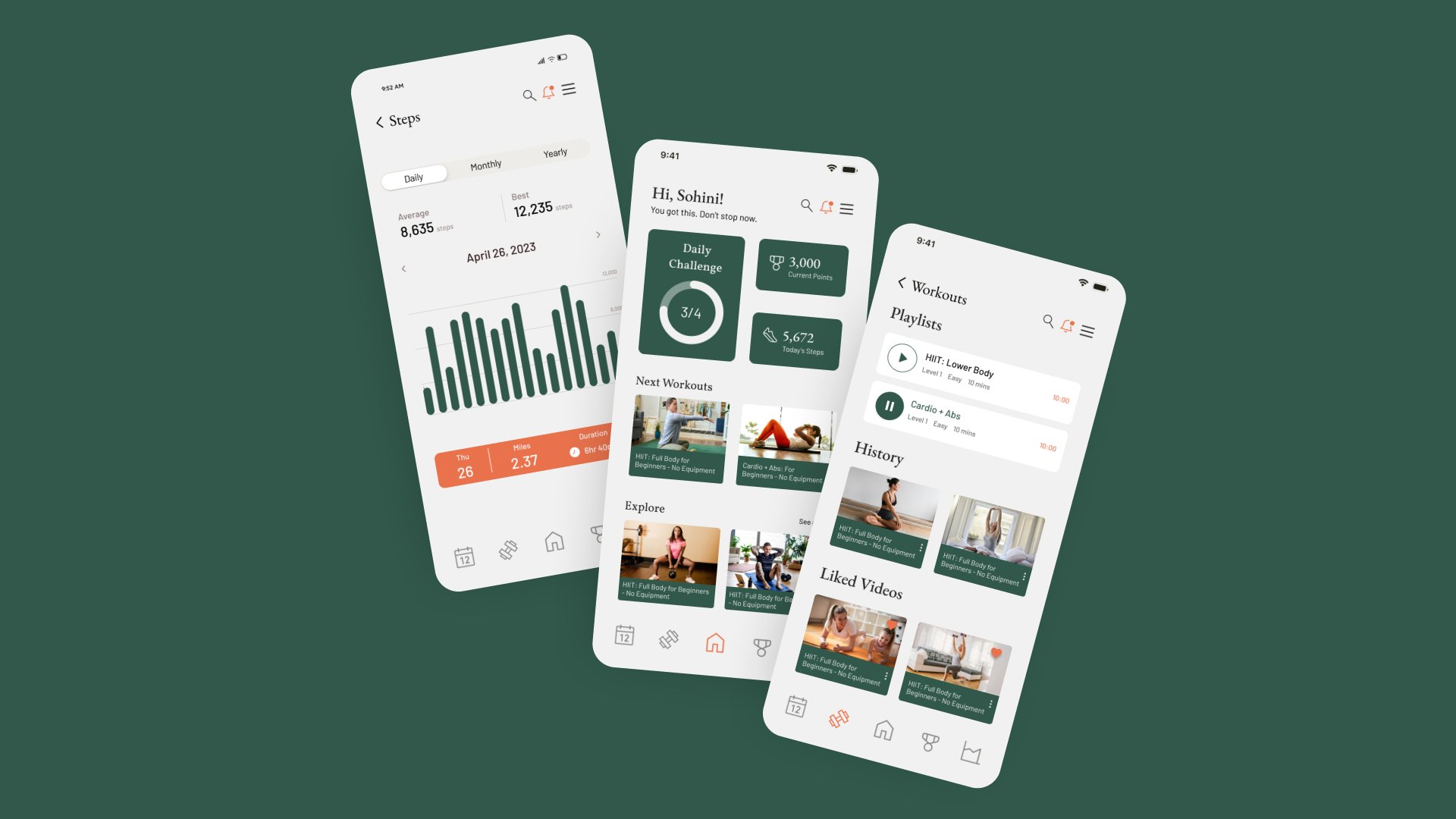
It’s been a journey and we are finally at the end! Below are the full mobile mockups, prototype, logo animation, and responsive web mockups. Enjoy!
Here's the logo animation for Move Mate. My idea was to emulate movement and the running man image into one picture and voilà!
FIGMA LINK ABOVE!
Hindsight is 20/20…. Here’s Mine
If you’ve made it to the end, thank you! This project was FULL of learning curves for me and I cannot be more grateful for all that I picked up… let’s go over a few shall we?
One, I finally learned the basics of auto-layout, components, and variants. It was frustrating to get the hang of, especially auto-layout, and honestly till this day it still doesn’t always do what I want it to do. But, hey! You keep going.
Two, proper feedback will only make you a better designer. As someone that comes from a healthcare admin background, I am no stranger to feedback on my work, but design feedback? Whole other ballgame. At first, I’m not going to lie, it made me insecure and filled my head with thoughts like: How did I not catch that? Am I ever going to get the hang of this? Now, I’m here to say that I have these thoughts less and as my design skills continue to strengthen, my confidence will do the same.
Three, animations are so cool! I know it’s a simple and perhaps silly thought, but I never did animations till this project. At first, it was a little confusing, but I quickly got the hang of it. Honestly, the joy I felt when my “moving running man” finally did what I wanted it to do was like nothing else. One of my goals for my upcoming project is to dive deeper into the world of micro animations and hopefully create moving pieces that bring others as much joy as it gives me!


