Med Doc
Cancer is scary, but it doesn’t have to be lonely.
As one of the top leading causes of death in the WORLD, cancer can happen virtually anyone. Coming from a healthcare background myself, I knew I wanted to make a product that allows cancer patients to take back control of their health.
That’s why I prototyped Med Doc, a web-responsive app that uses organization and health literacy tools to provide confidence, clarity, and support for all cancer patients.
Project Type: UX/UI
Case Study Length: 7 months
Role: UX/UI Designer, UX Researcher
Tools: Figma, FigJam, Optimal Workshop, UsabilityHub (Lyssna)
So What’s The Problem?
All cancer patients are not given the same resources, a prime example of the existing divide and inequity in healthcare
Cancer is an emotionally difficult disease to navigate, and patients are not given many outlets to process their feelings
Cancer treatments are too expensive for the average person, so gatekeeping resources is absurd
The number of appointments thrown onto a patient’s calendar is overwhelming, and patients need a way to organize their new hectic life
How Did I Find This Out?
Competitive Analysis
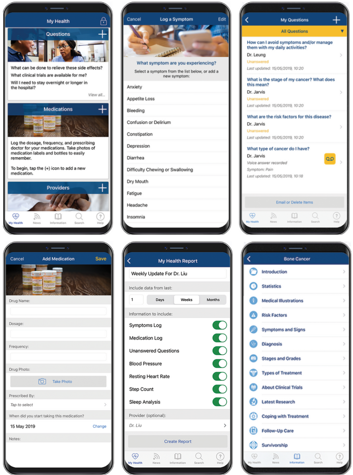
UX Design, to me, is not necessarily sketching out the next million dollar idea, but rather how to improve the current experiences out there. With that said, I analyzed two products: My Cancer Tracker and Cancer.Net Mobile (CNM).
My Cancer Tracker offers patients a platform to track their cancer journey and keep tabs on their treatment to ultimately navigate their prognosis.
CNM is a mobile application made by the American Society of Clinical Oncology to provide cancer patients various tools they can trust as the information comes from credible oncologists.
In my full competitor profile, I included each of the products’ key objectives, overall strategy, market advantage, marketing profile, and SWOT profile.
I also did a general UX analysis of My Cancer Tracker as I was more intrigued by this app as it offered some unique features the other did not.
User Interviews
I knew my next step was to conduct my own research because what I got from the competitive analysis only brought on more questions than answers. Hence, I conducted 3 user interviews (2 patients and 1 oncology nurse navigator, summary below) with 3 research goals in mind:
Identify the user’s pain point’s in regard to their cancer journey
Identify the kind of resources that would be useful for cancer patients (educational, financial, psychological etc.)
Determine how chaotic the cancer journey is for patients and what usually happens in the beginning, middle, and end of their journey
With these goals in mind, I came up with 11 questions for my two patients:
Tell me about your cancer journey? How did it begin?
What information was given to you and did you feel like that was enough? Why or why not?
What tools were you given to help make your journey better?
What tools did you sought out to help make your journey better?
What tools did you wish you were given to make your journey smoother?
What did your appointment routine look like?
What was your medication routine like?
What were your feeling throughout this journey, and how did you process what was going on? Did you feel like you had any outlet?
What were the side effects of chemo and radiation if you got both or either?
Did you feel like you understood the medical terminology being discussed around you? Why or why not?
How are things now?
For my oncology nurse navigator, I came up with 5 questions:
What resources are given to newly diagnosed patients?
What kind of specific financial assistance information is given to patients to help with the burden of medical costs?
What are the symptoms of chemotherapy and radiation?
What does the transition from the patient’s mindset of “I’m going to die/my life is over” to “there is hope” look like?
What are the current gaps in oncology?
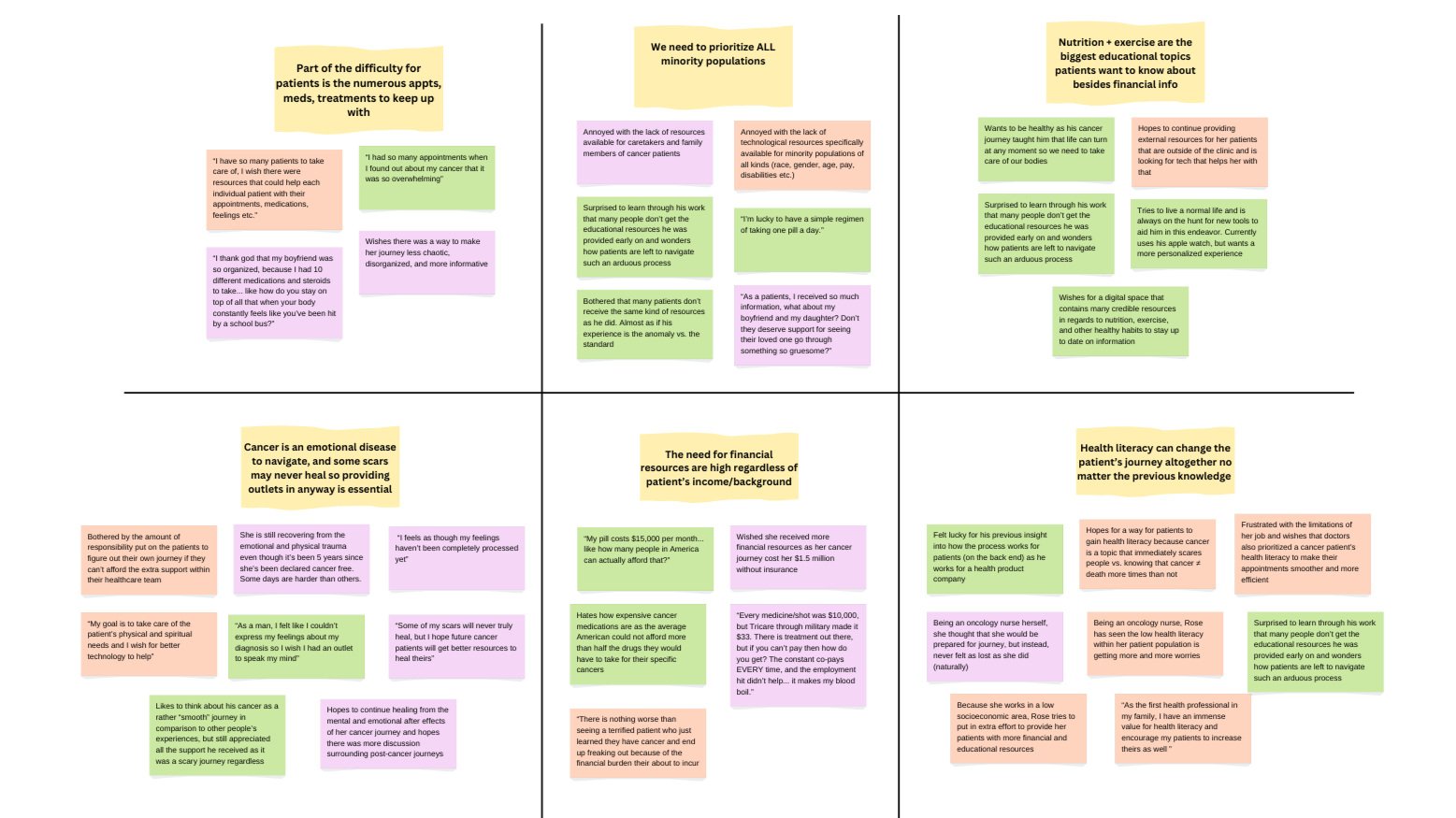
After completing my user interviews, I sorted out all my data by making an affinity map (linked here, and shown below). I ended up identifying six different themes and create 2 user personas from this analysis.
Affinity Map
User Personas
Looking at all the themes that emerged from my interviews, I originally wanted to create multiple personas. I also wished to capture as many major demographics as possible since diversity is extremely important to me.
With all this in mind, I identified some patterns between the themes which allowed me to boil it all down to 2 strong personas that will properly represent my ideal users while maintaining the level. of diversity I was aiming for.
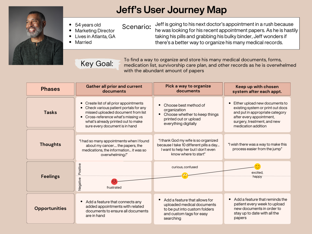
So without further ado, meet Anna and Jeff!
So What’s Next?
Now that I have enough background research to put myself into the user’s shoes, the next step in my process is to translate Anna and Jeff’s needs into product features that’ll solve their problems!
First things first, the app’s name! I went with Med Doc so users know it’s a medical app that stores and contains helpful information for the user’s convenience. In terms of the actual tools, here’s what I came up with:
A medical records section so Jeff can finally upload and organize all his appointment and treatment papers. This way, he or his wife won’t have to go looking for any information as everything will be stored on Med Doc. Moreover, whenever they go to the doctor’s they can pull up things quickly in case the doctor asks for it or they have a particular question!
A resource library so Anna can learn how to help her parents with the bills, Jeff can start learning better nutrition and exercise habits, and both can seek credible emotional and mental health advice to aid their mental health!
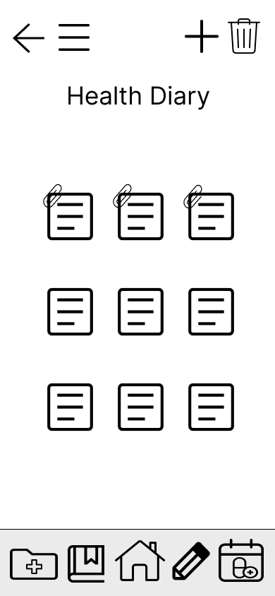
A health diary so Anna and Jeff can have a safe outlet to write/type their heart’s desires. Though counseling services can be extremely helpful, sometimes a private space can be equally helpful. In this feature, Anna and Jeff can add pictures, nutrition logs, exercise plans, medication reminders too!
An appointment calendar so Jeff won’t miss another appointment and knows exactly when the next one is. He can add various kinds of appointments like follow ups, treatments, and even a reminder for his walking time with his wife!
Sitemap
With my 4 core features decided, it was time to move onto building the informational architecture (IA) of Med Doc. I reviewed some other health apps to see what their basic structure looked and what people are already familiar with. As a UX Designer, one of my top goals is to reduce the user’s cognitive load as much as possible.
With that said, here is my first sitemap (shown below). I knew I wanted the main features to be available on the homepage for easy access. From there, I started adding the details such as sub-features for each tool. I will mention, looking back, I didn’t understand how the shapes affected someone’s perception of the app’s structure from first glance. Thankfully, this was not my final version!
Card Sorting Test & Revised Sitemap
After building my first site map, I wanted to make sure the IA was intuitive and just made sense, you know? To get this information, I found it best to do a card sorting test.
I had a total of 10 participants who provided me with really good feedback on what worked in my original sitemap and what needed some tweaks.
Here were my insights:
Most people sorted the cards into what I thought, but surprisingly people put the categories of emotional health, fitness and healthcare tips into the health diary feature vs the resources library feature (I called it educational library then).
I also noticed that certain small tools like the highlight tool were put into the resource library feature and the healthy diary. I could see how the options were slightly confusing.
Overall, I decided to add emotional health, fitness, nutrition, healthcare tips etc. into the health diary section too so people could read about them in the resource library and write about it in the health diary.
Below are my card sorting results (standardization grid & similarity matrix) and new sitemap!
Journey Maps
Having a solid sitemap in my back pocket, it was time to make my journey maps. After assessing Jeff and Anna’s needs, I narrowed down on two common scenarios:
Anna has just come back from her doctor’s appointment and has so much homework to do before another round of chemo that’s going to make her tired again. Anna feels her mental health is slipping and is unable to go about her days feeling okay.
Jeff is going to his next doctor’s appointment in a rush because he was looking for his recent appointment papers. As he is hastily taking his pills and grabbing his bulky binder, Jeff wonders if there’s a better way to organize his many medical records.
Task Flows
At this point, I’m confident to say that making the user personas and journey maps brought me the clarity and compassion I’ll need as I continue this design process. Up next is the user task flows. Based on the scenarios I mapped out earlier, I decided to do three, one for Jeff and two for Anna:
Organizing Medical Records
Using Educational Resources
Writing In Health Journal (didn’t change the name yet).
Is It Time To Design Yet?
Yes! My next step was to start sketching out the low-fidelity wireframes. I started out with pen and paper and worked my way up to some rough drafts in Figma. After some back and forth feedback from my mentor and some usability testing, I moved on mid-fidelity (high-fidelity coming soon)!
When I was sketching out Med Doc, I knew what each feature was going to roughly look like, but let me tell y’all…. the homepage…. she was a beast to figure out. I’m not even going to lie. The amount of iterations I went through on this alone was crazy.
However, I believe that progress should always be the goal, not perfection, so I’m happy with how the homepage looks now (even if it took Lord knows how many changes to get here).
Low-fidelity Wireframes
Like I mentioned earlier, I started off with pen and paper as I find that I work best this way to start off. Something about not using tech during the first round of sketches helps me not get overwhelmed and distracted.
Anyways, I started off ROUGHLY drawing the flow for the four core features (both mobile and desktop versions). Below are the sketched and some explanations behind my design decisions. The order of the sketches are:
Core Feature #1: Opening up a blank diary page
Core Feature #2: Uploading files to the medical records section
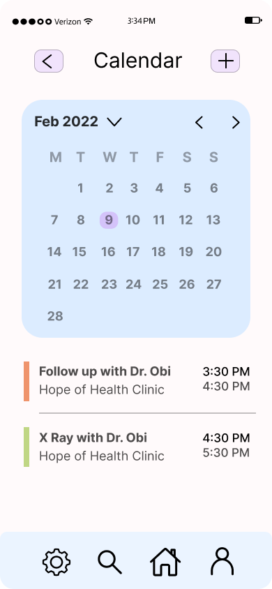
Core Feature #3: Viewing today’s appointments in the calendar section
Core Feature #4: Viewing the financial resources section of the educational library (this was the old name, later changed it to resource library)
Mid-fidelity Wireframes
I’m so glad I started off with pen and paper, because it was time to start building these designs on Figma, a platform I’ve never used before… till now! Learning the basics wasn’t too bad, but I started to face some obstacles down the road (more on that at the end). So with that said, below are the mid-fidelity wireframes for Med Doc. To help, this is the order of the wireframes:
Dashboard
Medical Records Homepage
Upload Records Page
Dashboard
Educational Library Homepage
Financial Advice (specific resource example)
Dashboard
Health Diary Homepage
Blank Health Diary Page (filled to show example)
Dashboard
Today’s Appointments View
Dashboard
But Is It User Friendly?
Now that I have the basic structure of Med Doc laid out, I wanted to do some usability testing to see how people are feeling about it and what improvements I can make. At the end of the day, I want my designs to be intuitive and that's a very subjective thing.
With that in mind, I did an in-person usability test with 6 participants who had a healthcare background, either from an educational standpoint or the caregiver end (some tested the mobile version while others tested the desktop version).
I will add a link for my test script, but here are the two background questions and four tasks I asked each of my participants to do. I wanted my tasks to be very relatable and easy for my test participants to empathize with.
Background Questions:
Do you use any health related apps to track any part of your health journey. If so, which ones and why do you think they are helpful?
As a future doctor, how do you think health apps aimed at helping a patient’s journey will truly impact them?
Tasks:
You just came back from the doctor’s office and need to upload your recent reports to your medical records section. How would you go about doing that?
You want to learn new ways to save money as these bills are getting expensive. Where would you go to find this information?
It’s been a pretty crappy day and all you want to do is write your feelings out. Where would you go to make a new diary entry?
You realize you have an appointment tomorrow, but forgot what doctor is seeing you. Where would you go to find this information?
Usability Test Goal and Objectives
Though this information is in the test plan, I want to highlight the goal and objectives of this test.
Goal
To test the intuitiveness and effectiveness of Med Doc in hopes of discovering potential improvements. By giving test users a basic set of tasks to complete on Med Doc’s prototype, like navigating the app’s core features, I hope to measure how the test users understand the app so I can increase its usability.
Objectives
Observe if test users can get through with all the core features (medical records, educational library, health diary, and calendar) with ease and quickness
Determine any necessary changes that need to be made to the core features if test users are having difficulty navigating the four core features
Results
The usability test yielded wonderful results and very helpful feedback. I will link my full test plan that includes a link to the participant information, schedule, and the full results/changes I made to the prototype.
Here’s a summary of my findings:
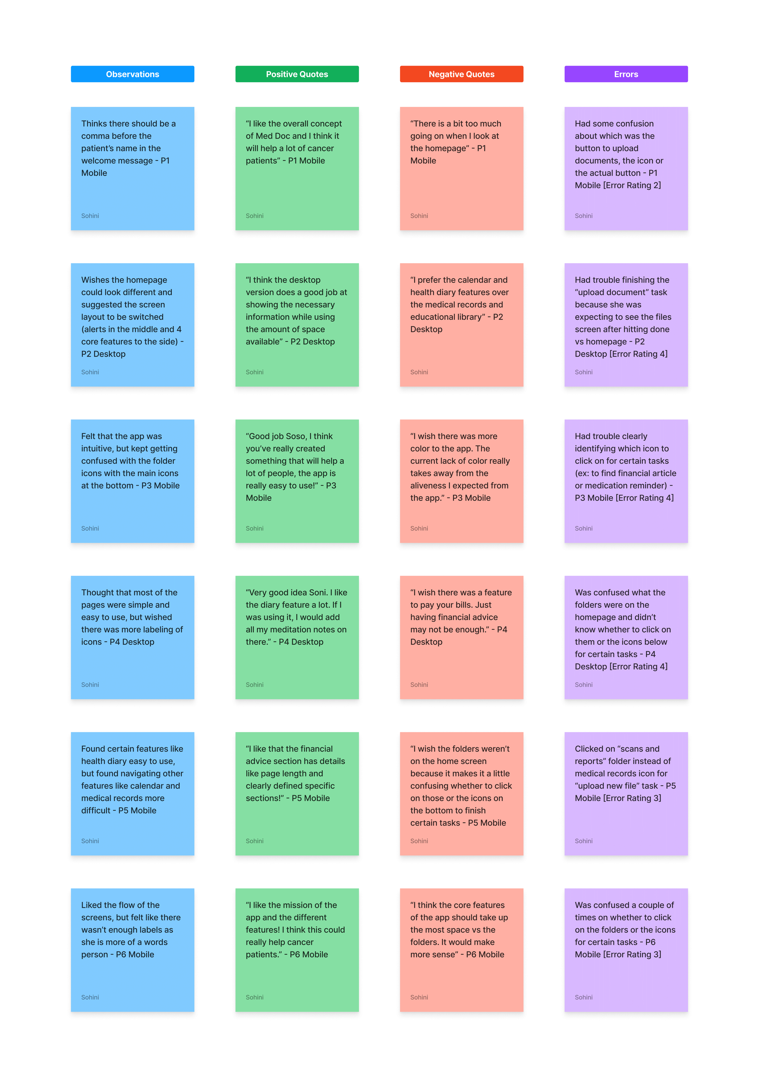
All in all, my test users believed the app will be very useful for cancer patients as there is nothing on the market they have seen that resembles Med Doc. Users especially liked the Health Diary feature. However, test users were confused with the importance of the folders versus the main icons at the bottom. Redesigning the mobile/desktop homepage and adding labels to icons will ensure a smoother, more intuitive user-centered experience.
Below, I’ve included an affinity map, rainbow spreadsheet, and a breakdown of my prototype changes!
Affinity Map
Rainbow Spreadsheet
A/B Testing
From the usability test, I made some prototype changes that I felt confident in. However, some changes I was still contemplating on. Hence, I decided to do an A/B Test to see which version my users prefer. I had a total of 11 participants and 3 A/B tests. Here’s what I was testing:
Calendar Icon (I couldn’t decide between two)
Onboarding Layout (zig zag or straight)
Desktop Layout (where the core features should go vs. notifications)
Here are my results!
Ready For The Reveal?
Finally, we are at the end! At this point, all that I had to make was my Design Language System and my refined mid-fidelity prototypes (both of which I will show below). My DLS explains all the color and language choices I made, but I’ll give a snippet here.
I wanted to go with fun and playful colors, while keeping the same tone with the language. Cancer patients deserve all the empathy and this app was designed with this thought in mind. My goal was to make Med Doc easy to use, personalized, and useful. I believe I did just that, hopefully. Anyways, here’s the DLS and current mobile prototype!
Design Language System
And That’s A Wrap!
Whew! I know that was a lot. I’m still getting used to the portfolio format, but you know what they say: practice makes progress. That’s honestly the motto I went with throughout this whole project too.
As someone who’s transitioning into this industry, I’m learning a lot along the way and it’s been a roller coaster, honestly. The research part of this project was easy to navigate as I’ve practiced various research methods in the past. The UI part though…. she was a whole different story.
Like I mentioned earlier, I picked up the most basic skills of Figma quickly, but learning things like spacing, grid lines, colors, hierarchy, typography etc. was definitely a journey that is still ongoing. I am by no means as confident with my UI skills as I am with my research skills, BUT I AM CONFIDENT that I’ll get there one day because I never stop at “I don’t know”, I always follow it up with “but, I’ll figure it out” and usually, I do!
Overall, Med Doc will always be a special project for me, not only because of the skills I picked along the way, but more so because I was able to build a prototype that has the potential to help so many cancer patients take control of their health and not feel alone. This is the kind of impact I hope for all my projects to have!


